Logs are the heartbeat of the Redox dashboard: a real-time record of how data moves through and is processed by the platform. Customers rely on Logs to trace messages, investigate issues, and understand what’s happening to their data and why. Because Logs sits at the center of their day-to-day workflows, any change to the experience carries real weight.
As we incorporate modular processors into customer workflows, we’re enabling more powerful, context-driven processing like branching logic, enrichment, validation, and rules-based routing. That modularity gives customers more flexibility and control, but it also means there’s more happening behind the scenes than Logs historically needed to show.
Our challenge was designing a UI that could surface this new modular workflow clearly without making Logs feel heavier, more complex, or harder to scan. The experience needs to reflect the system accurately while still supporting the way customers actually use Logs in practice: quickly, intuitively, and often under pressure.
Because Logs are such a critical part of the dashboard, we didn’t want to rely on assumptions. To get it right, we leaned into one of our greatest assets: our customers.
Testing the new experience
We built an interactive prototype and tested it with a mix of internal and external users including 6 Redox Customer Service team members and 11 customers.
Participants completed realistic tasks as if they were using the live dashboard: digging through Logs, searching for information, and trying to understand what happened to their data. Observations focused on how the language and structure landed, and whether the experience felt intuitive.
The goal wasn’t to validate the design, but to pressure-test assumptions and understand how people actually think about Logs when they’re in the middle of real tasks.
Key learnings: reduce friction and be human
These sessions provided valuable insight into how customers approach Logs and what matters most when they’re using them. A few key themes stood out:
Payloads must be fast and effortless to access
When customers search through Logs, they’re almost always trying to get to payload snapshots. That path needs to be obvious, fast, and effortless. Anything that slows that down, or makes it harder to scan, creates friction in a moment where users are often already under pressure.
Clear, human language matters more than internal precision
We spent a lot of time talking through labels and terminology with participants. Asking questions like, “What would you call this?” or “How would you explain this to a teammate?” helped identify where internal language felt jargony or unclear. Small wording changes made a big difference in how intuitive the experience felt.
Simplicity matters more as complexity grows
Because modular workflows introduced additional steps, we had to be intentional about simplifying wherever possible. Customers identified which subtitles weren’t adding value, where color could improve scannability, and how to make the experience feel simpler, even when the system underneath is more complex.
These insights directly impacted the next iterations and guided subsequent UI decisions.
What to expect in the updated Logs UX
Redox customers can expect to see the following changes in your dashboard starting on February 4, 2026:
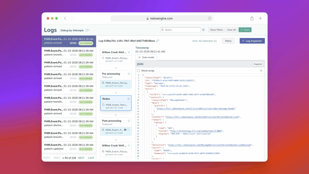
- A vertical stage layout replaces the horizontal design, making it easier to follow message processing from start to finish
- New Snapshot stages show the message payload at three key moments: when it enters Redox, at subscription lookup, and when it leaves Redox (using the same titles as today’s 3-box diagram)
- New Processing stages reveal the work between snapshots, helping you understand what happened to your data (not just the before/after)
- Log Details and Log Inspector are now aligned into the same stages, so the information you need is grouped where it’s most relevant
- Improved visibility into customizations like translations, config modifiers, and filters so it’s easier to understand what’s been applied and when
Designing around real workflows
Testing reinforced something we care about deeply: good design isn’t just about representing the system accurately. It’s about aligning with the mental models and workflows of the people using it.
Real-world customer feedback enabled a design that better supports how Logs are actually used: clearer paths to critical information, language that feels more human, and a structure that helps people move quickly without unnecessary complexity.
As the new experience rolls out, the learning continues. We’ll keep learning from real-world usage, listening closely to customer feedback, and iterating over time to make Logs an even more reliable and intuitive place to trace and understand data.
If you’re interested in being a beta customer for future releases or taking part in design testing, we’d love to hear from you!